

In 2014 we saw a lot of new trends in web design, some of which are inspired by magazines and press while focusing more on images and typography.
At Netstudio, we have tried a lot of new trending techniques as well as more “traditional” on older and newer sites of our own. 2015 was the year that we enhanced all of these techniques. Responsiveness is ultra hype these days because of Google’s latest algorithm changes, while although it’s age, Flat Design looks like that is gaining new fans. Let's see some of the techniques that we will encounter the rest of 2015.
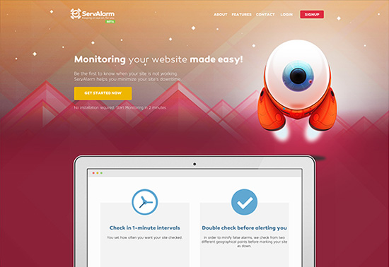
Flat design
Flat design is the minimalistic approach that takes advantage of simple elements and solid colors, without the 3D perspective. It’s not something new, on the contrary, it’s in the spotlight for the last 2-3 years and will probably continue for the rest of the year. Simple lines, geometric patterns, excessive usage of icons, minimum usage of gradients and shadows that give a cleaner look that makes it easier to handle elements in different screen widths. Flat design gives us the ability to use vector shapes on our websites by converting them to .svg format files or icon fonts. Also, we have the privilege to handle them easier by changing their color, size or even bring them to life by giving them some motion.
Responsive design
Most of the websites now are designed to be fully responsive on various screen resolutions. This trend of the past years tends to be the standard for websites. Mobiles and tablets have already become part of our hand, there are now many people that “surf” the web only from mobiles devices (http://www.smartinsights.com/mobile-marketing/mobile-marketing-analytics/mobile-marketing-statistics/). For our website, in order to be fully functional and not only just accessible from mobiles, but we also have to be extra careful when designing in a responsive way.
The cost of a custom responsive design may triple the project’s cost, but it’s something that is mandatory if our goal is to be on the top of the competition.
Something very important we should take under consideration is that Google recently announced that if the site is mobile friendly it’s also better ranked in mobile searches.
Wheels on fire!
In the past years it was assumed that the user should have all the important information above the fold. But this assumption is no longer the case! The truth is that now the user wants to have all the information about the site on the front page. This means that a large amount of important content has to be presented on one page with endless scrolling or else the so-called “Infinite scrolling”. Users are nowadays used to scroll this way from mobiles. It’s easier to make a simple move to see all the information that you want instead of searching through the menus on different pages.
Parallax scrolling
Parallax scrolling is a technique in web design, where background images move slower than foreground images, creating an illusion of depth in a 2D scene and adding to the immersion. All that information we have now on every page is brought to life and makes the user experience more attractive. The objects are appearing while the user scrolls all the way to the bottom giving the impression that he is a part of a story and wants to see the rest of it!
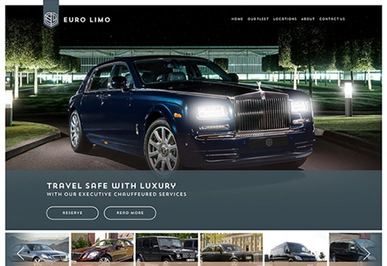
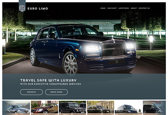
No more sliders
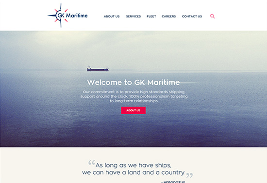
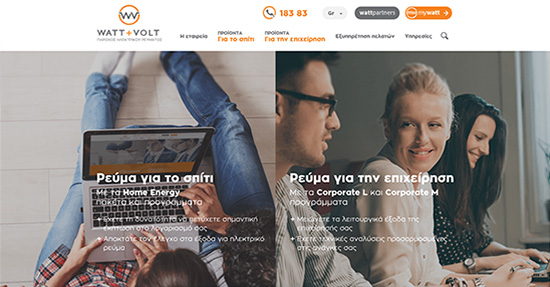
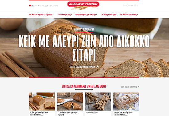
Sliders are starting to fade off (http://shouldiuseacarousel.com) and their place is taken over by big images or videos. We can see them as the main subject or in the background combined with strong typography and in some cases with their best friend, the ghost buttons :) Another trendy look for this year is the divided screen like the example below:
Focus on typography
Big titles, strong messages and… typography is now the key player also on the web! Now, we have the ability to use nearly every font we want, without the fear that it won’t appear correctly or it will make our website heavier. This fact gives us the design freedom we’ve always prayed for, so we can be more creative.
Hidden menu

Hidden menus were exclusively part of mobile devices. The latest design trends made website menus look identical on both mobile and computer versions. With the emerge of mobile-first website design, we’ll see more and more often the use of a single button for the menu. The interesting thing here is that user experience is becoming more familiar on different devices.

By Christina
Designer
Published on 08 Jun 2015